Software
A Smarter Way to Analyze Your Business
Products & Services > Software
Summary Chart
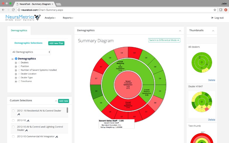
The Summary Chart is one of several analysis tools for “big picture” analysis. This chart shows all of the scored data in one view for any selected demographic cut.
The scored elements are nested in a radial configuration for easy reference. Color coding allows the user to quickly form strategic impressions and improvement concepts.
Thumbnails of any demographic cut or other analysis maps can be saved in the periphery for easy reference.
Summary Chart with Drill Down Mini-Report
By hovering the cursor over any element of the summary chart, the user will see a popup window the contains a detailed description of the Best Practice and the standard deviation representing the makeup of the score for that Best Practice.
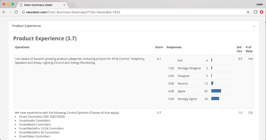
By clicking on the chart element, the user can call up a “mini-report” that contains the scores of the items that make up Best Practice (individual questions) and the respondent count. Not all respondents answer all questions.
Opportunities Concepts Chart
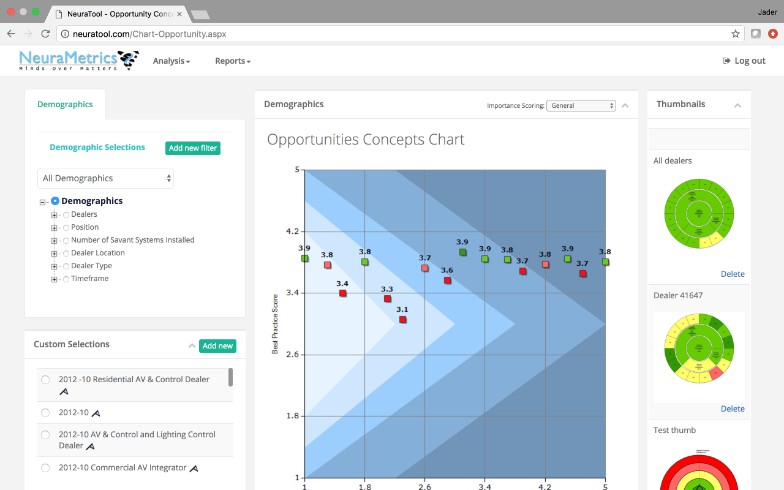
The Opportunities Concepts Chart presents all the best practices in terms of their survey score and their importance to the company. It allows management to focus on channeling investment into areas that have the largest potential for immediate and significant improvement for the company.
The Hayes Chart
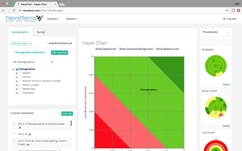
The Hayes Chart allows the direct comparison of Demographic Entities on selectable scales derived from key attributes relating to Best Practice success factors.
These attributes can be customized into an unlimited number of clustered survey questions which can be used as axes on the chart. This display helps frame strategic issues and compares Entities on various measures of effectiveness.
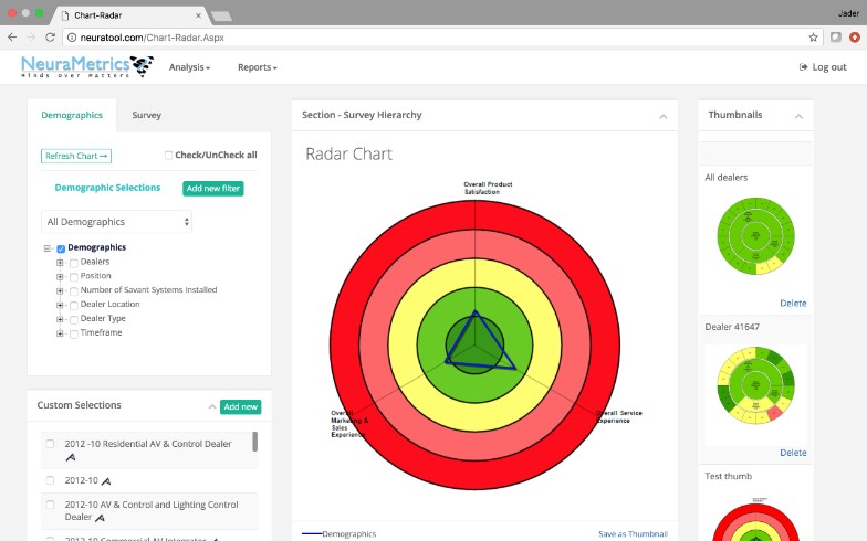
The Radar Chart
The Radar Chart allows comparison of a set of scores for several demographic cuts. It is excellent for comparing Entity scores in select performance areas.
This chart has the advantage of allowing multiple entities to be shown at the same time.
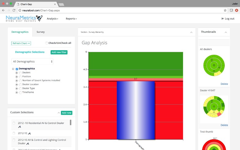
The Gap Chart
The Gap Chart allows comparison of a single score for many demographic cuts. It is often used to find “pockets of excellence” for specific analysis items.
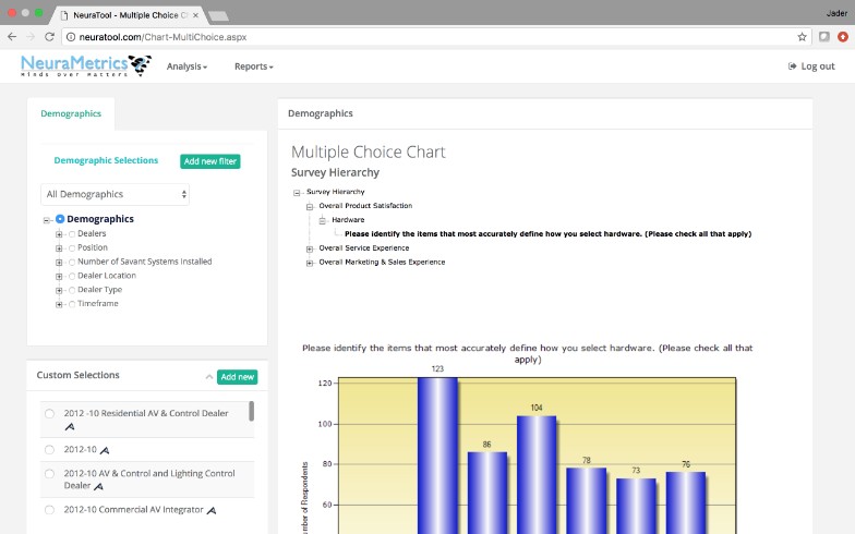
Multiple Choice Summary
The Multiple Choice Summary contains a Survey Tree of all multiple choice questions. The user can select any question and any demographic cut.
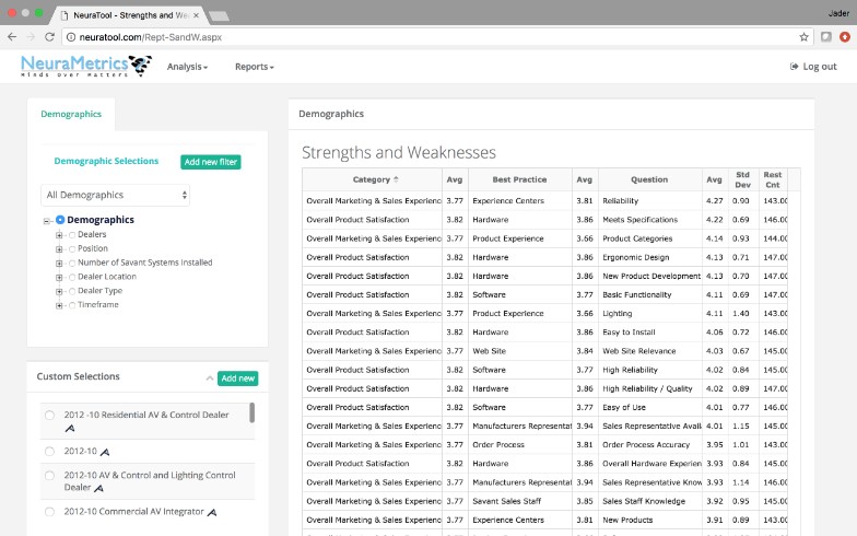
Strengths & Weaknesses
The Strengths & Weaknesses chart contains a summary of all the scored elemtns for any demographic cut. This chart can be used to highlight the specific weakness of a demographic entity. Then, by using the Gap Chart, another entity that has complimentary strengths can be found. This assists in the “Self Healing” process.
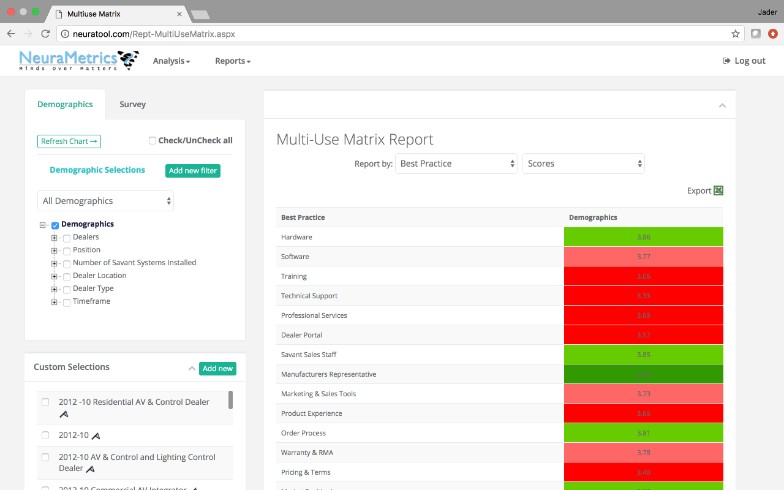
Multi-Use Matrix
The Multiple-Use Matrix chart compares individual entity scores on every Best Practice. Quickly see which entities have a “pocket of excellence” in areas where other entities are deficient, creating the opportunity to deploy existing assets to areas where they are needed. This can often help to avoid unnecessary expense on outside resources.
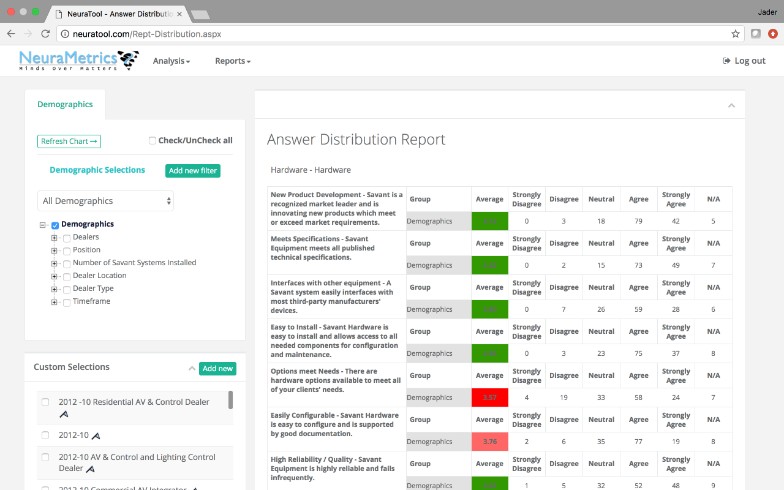
Answer Distribution Report
The Answer Distribution Report allows the user to display the distribution of Radio answers for any combination of entities and any demographic cut.
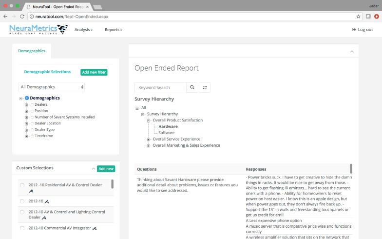
Open Ended Report
The Open Ended Report allows the user to view all the text answers. While the respondents remain anonymous, the answers to the open ended questions that are asked can be displayed for any demographic cut.

